Insurify - top insurance provider
Insurify - top insurance provider
Insurify - top insurance provider
https://insurify.com/
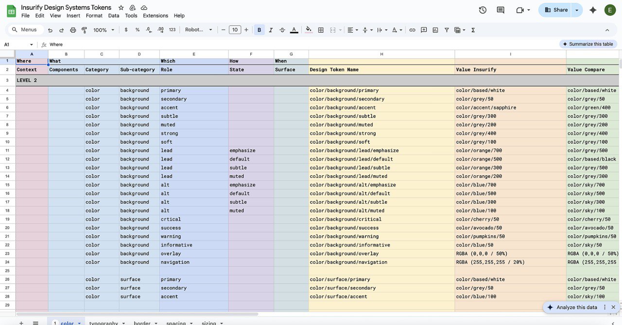
Led the design system, organizing multi-brand tokens, components, and variables, reducing design-dev handoff time by ~40% and saving 500+ hours/year in resources.
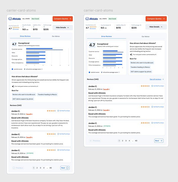
Improved conversion by 18% by redesigning the Insurance Rates component, optimizing user flow and visual hierarchy
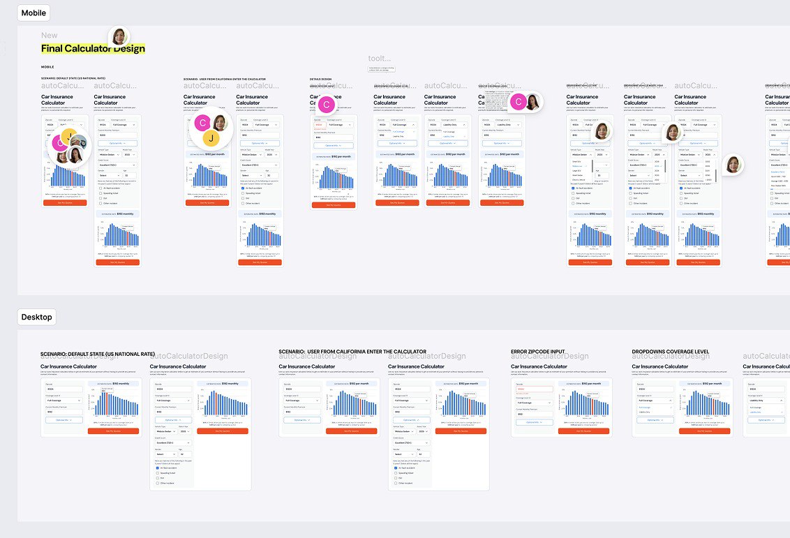
Designed key features (calculator, homepage redesign) to enhance brand trust, collaborating with stakeholders, PMs, and developers.
After understanding users and current problems, I summarized 3 principles that I always kept in mind when redesigning the app:
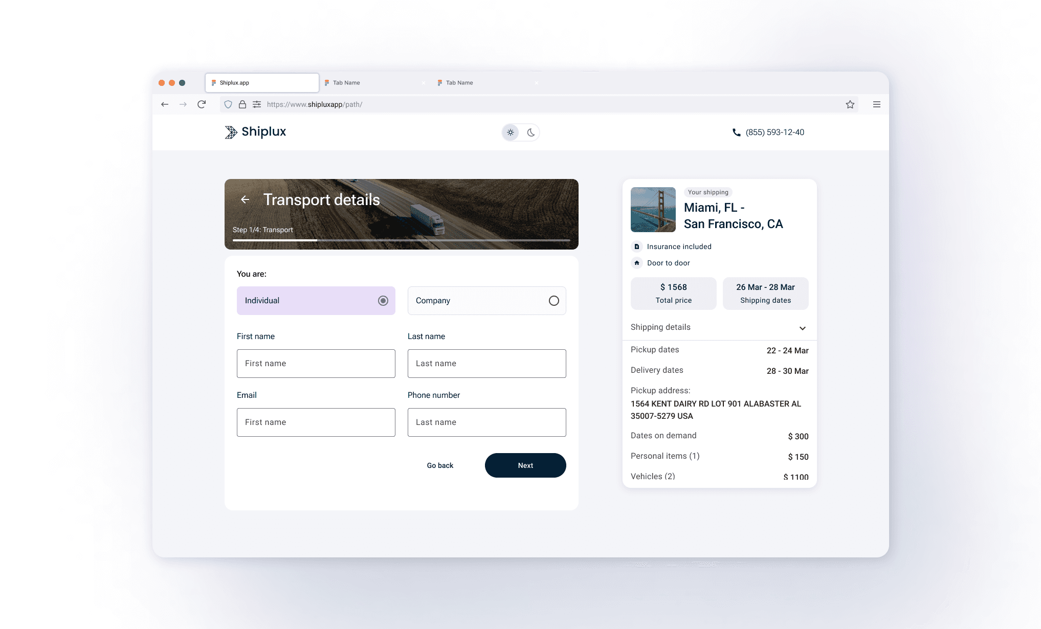
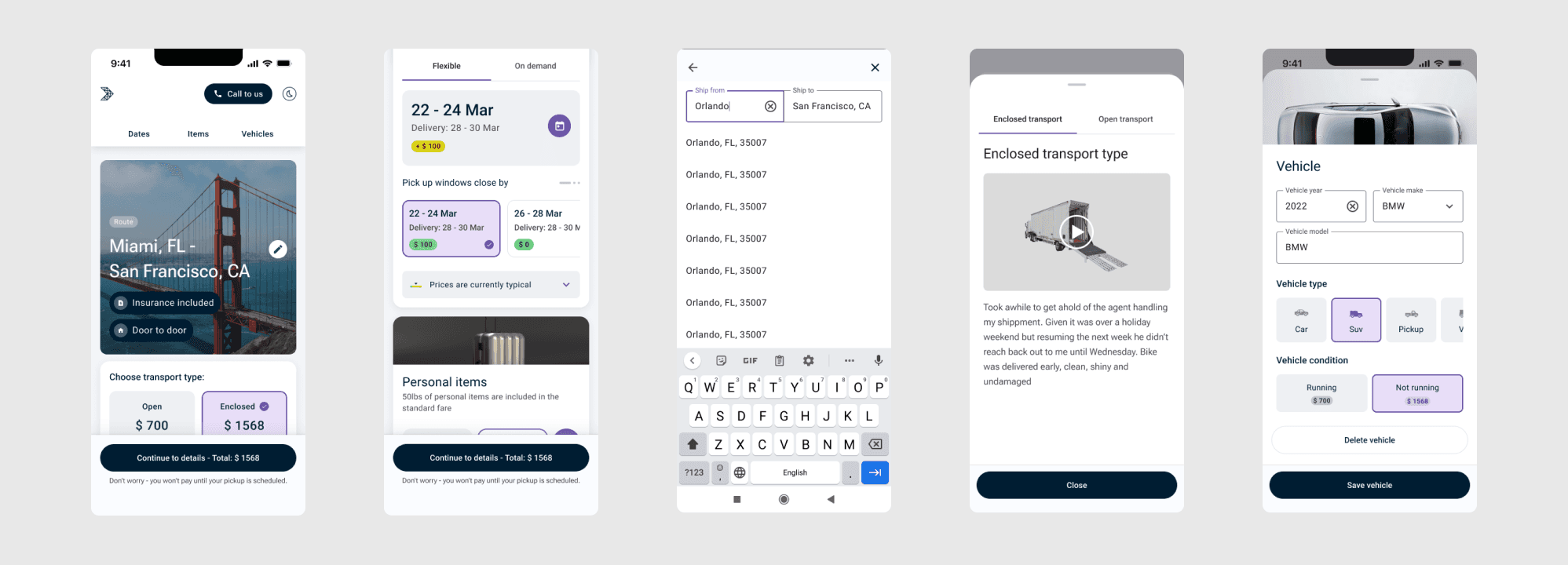
Ensuring familiarity for users was pivotal, prompting the adoption of a pattern akin to hotel or airline ticket booking systems. The design featured options on the left and comprehensive details, including pricing, on the right. Additionally, to enhance user understanding, a video was integrated into the transportation method section, offering a visual portrayal of the process:
design principles:
Step 1 - General Information

Stakeholders, development
team
Personas


The most challenging part


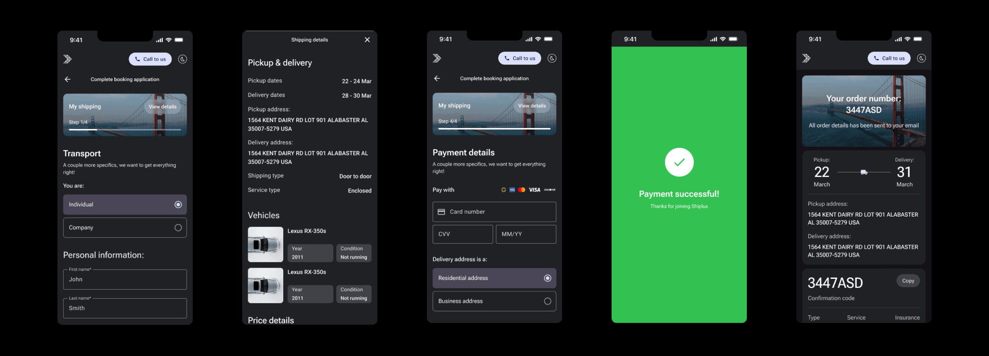
dark mode:

The challenge involves developing an app aimed at boosting car shipping leads while ensuring a user-friendly interface. The goal is to craft a form that calculates prices, allows option selection, and enables seamless payment—a process that is straightforward and convenient for customers.
Simultaneously, it's crucial to craft an application that delivers the desired visual impact; it should exude modernity and convey the luxurious essence synonymous with the company’s brand.
Challenge
To gain a deeper understanding of our users and their journeys, I interviewed our stakeholders shortly. As a result of the interview, I had enough information to build our personas:
Price transparency updates
Easy booking flow separated by steps
Create a feeling of care and reliability using the interface and graphical techniques
Help and tutorials on certain steps
Show flexible dates/ on demand dates availability
After the interview I defined goals for the booking app:
Enhance the user experience of Shiplux through personalization
Define a user flow and simplify critical steps
Clear instructions on how to fill out forms
Consistent design and clear patterns
Help with choosing the type of shipping method for certain vehicle
Show additional options as upsell (business goal)
Steps 2,3 and 4 - complete personal data, payment and post-sale experience
mobiles:
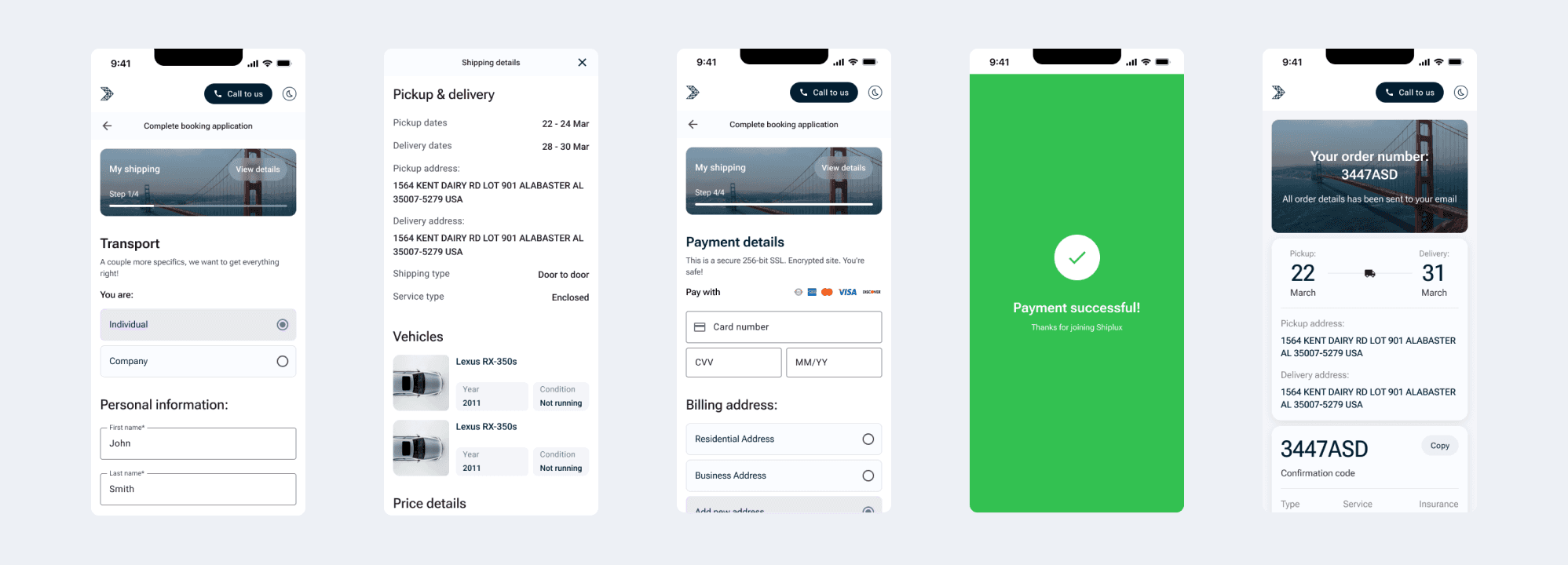
I divided the form into several steps and added a progress bar, so the process became much easier and clearer. For speed, in the personal information section, the user’s data is entered automatically from the form of the site on which he left the application. We also included a post-sales experience - a booking page with information for the next step.
Before transferring to development, we checked the color contrast. We have many users 40+, so clarity and correct contrast of elements is very important. I also conducted about 10 usability tests where I asked users to fill out a form from different devices.
The basis of our design system was Material Design 3, but I customized some elements. In the process of my work, I created a unified design system for Shiplux that can be used in future and current projects.
design system:
The application is currently under development and here are the steps I would take now:
- Test bugs of the application together with the team and developer and look at different flows, adjust the frontend on each step
- Create a page for users to rate the app after completing a booking
- Analyze metrics at each step, as well as overall conversion
- Conduct in-depth interviews with users and come up with hypotheses that will improve the user experience and bring profit to the business
takeaways:
Ekaterina Pipko
2024
Ekaterina Pipko
2024